Styling
The tree comes with very basic style.
The following classes are available for customization:
- .tree
- .tree-node
- .tree-node-wrapper
- .tree-node-expanded
- .tree-node-focused
- .tree-node-active
- .tree-node-leaf
- .toggle-children-wrapper
- .toggle-children
- .toggle-children-placeholder
- .node-content-wrapper
- .tree-children
- .tree-node-level-X
Here is the result HTML of the tree:
<tree>
  <div class="tree">
    <treenode>
      <div class="tree-node tree-node-expanded tree-node-focused tree-node-active tree-node-level-1">
        <div class="node-wrapper">
          <span class="toggle-children-wrapper">
	          <span class="toggle-children">
  	        </span>
          </span>

          <div class="node-content-wrapper">
            <treenodetemplate>root1</treenodetemplate>
          </div>
        <div class="tree-children">
          <treenode>
            <div class="tree-node tree-node-leaf tree-node-level-2">
              <div class="node-wrapper">
                <span class="toggle-children-placeholder">
                </span>
                <div class="node-content-wrapper">
                  <treenodetemplate>child1</treenodetemplate>
                </div>
              </div>
              <div class="tree-children" hidden="">
              </div>
            </div>
          </treenode>
        </div>
      </div>
    </treenode>
  </div>
</tree>
Example styles
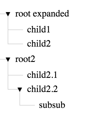
Branch lines
This theme puts explorer like branch lines that connect the parents with their children

.node-content-wrapper, .tree-children {
  position: relative;
}

.node-content-wrapper::before, .tree-children::after {
  content: "";
  position: absolute;
}

.node-content-wrapper::before {
  border-bottom: 1px solid lightgrey;
  border-left: 1px solid lightgrey;
  height: 28px;
  top: -17px;
  width: 20px;
  left: -28px;
}

.tree-node-leaf > .node-wrapper > .node-content-wrapper::before {
  width: 25px;
}

.tree-children::after {
  border-left: 1px solid lightgrey;
  height: 100%;
  top: -15px;
  left: -15px;
}

treenode:last-child > .tree-node > .tree-children::after {
  border-left: none;
}

.toggle-children {
  z-index: 1;
}
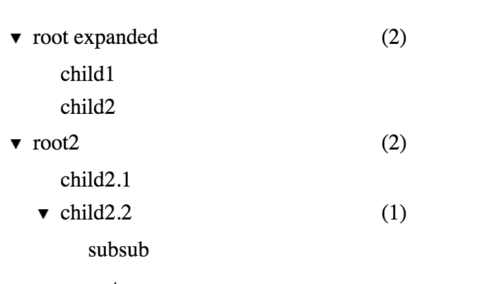
Pull right
This theme allows placing items in the right side of the tree nodes using pull-right class.
It is based on flexbox, so relevant only to browsers who support it

.tree {
  width: 300px;
}

.node-content-wrapper {
  display: flex;
  flex-wrap: wrap;
  align-items: baseline;
}

.node-content-wrapper {
  flex-grow: 1;
  position: relative;
}

.pull-right {
  position: absolute;
  right: 10px;
}
Send me your theme
If you've created a nice style for the tree, I will appreciate if you send me and I will showcase it here.
[email protected]
Updated less than a minute ago
